InterVarsity San Diego Merch Line (2025)
Brand Identity, Visual Design, Art Direction
April–July 2025
Designing community-first apparel that unifies leaders, strengthens identity, and reflects shared purpose.
01 Overview
In Spring and Summer 2025, I served as the Lead Designer for InterVarsity at UC San Diego, tasked with creating a new merch line that would represent our ministry’s identity, unify our leaders, and offer something the whole InterVarsity San Diego region would be proud to wear.
The result:
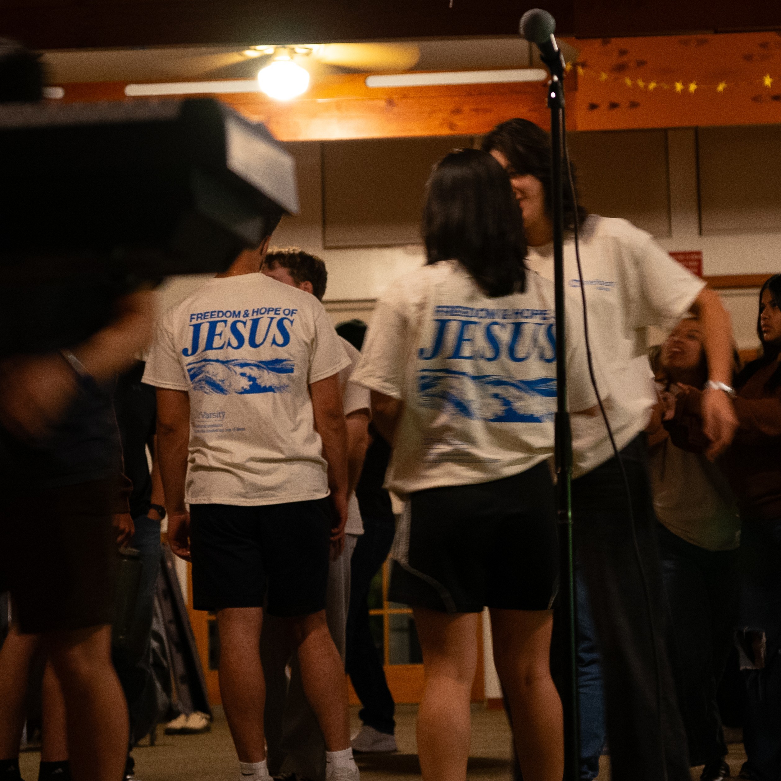
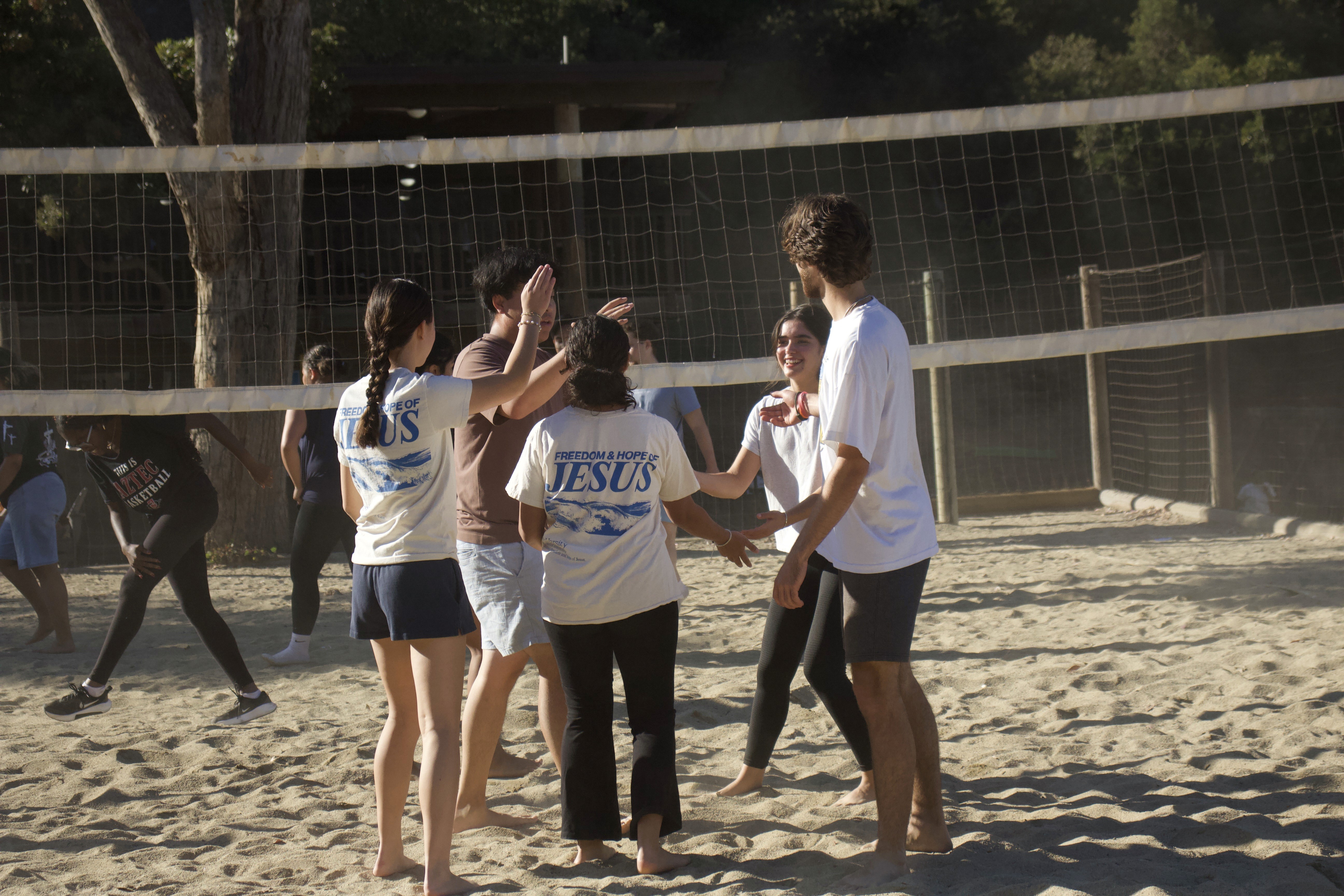
A leadership sweater and community T-shirt that quickly became beloved across the region — worn by leaders across multiple UCSD ministries and adopted by the entire InterVarsity San Diego Region as the official 2025 merch.
02 The Challenge
InterVarsity merch in previous years was:
inconsistent across campuses
outdated in style
not unified under a shared visual identity
something students wore out of obligation, not excitement
The core challenge:
How can we design merch that people are genuinely proud to wear — not just because it’s InterVarsity, but because it looks and feels good?
As a student leader and member myself, I wanted it to feel:
relevant
warm
expressive
communal
AND, especially, rooted in our shared faith and mission
Without being “Christian merch cliché.”
03 My Role
As Design Lead, I handled:
Concept development
Visual direction & moodboards
Typography decisions
Color palette exploration
Iterative refinement with leadership
Preparing production files
Vendor coordination & print specs
Ensuring designs worked for both leaders and the broader community
This project reflected the blending of design skills with ministry context — serving people through creativity.
04 Research & Insights
I conducted lightweight but targeted research through:
1. Leader feedback
I asked:
“What would you actually wear?”
“What styles feel most like ‘us’?”
“What colors represent our community?”
“How do we visually represent our mission in a subtle, modern way?”
This revealed:
students prefer bold, stylistic typography
muted, coastal tones match UCSD + San Diego identity
oversized, clean streetwear silhouettes feel on-trend
faith-based messaging needs to be warm, not preachy
2. Community observation
I looked at:
what students wear on campus
what sells in Christian apparel ecosystems
what aesthetics feel timeless rather than trendy
3. Regional identity
We wanted something that could work across multiple campuses, not just UCSD.
This meant:
clean symbols
non-location-specific designs
a universal message of mission + community
05 The Design Process
A. Moodboarding
I explored four visual directions:
minimal streetwear
retro collegiate
coastal / San Diego inspired
typographic scripture-led design
We aligned on a blend: clean streetwear + warm faith cues.
B. Concept Development
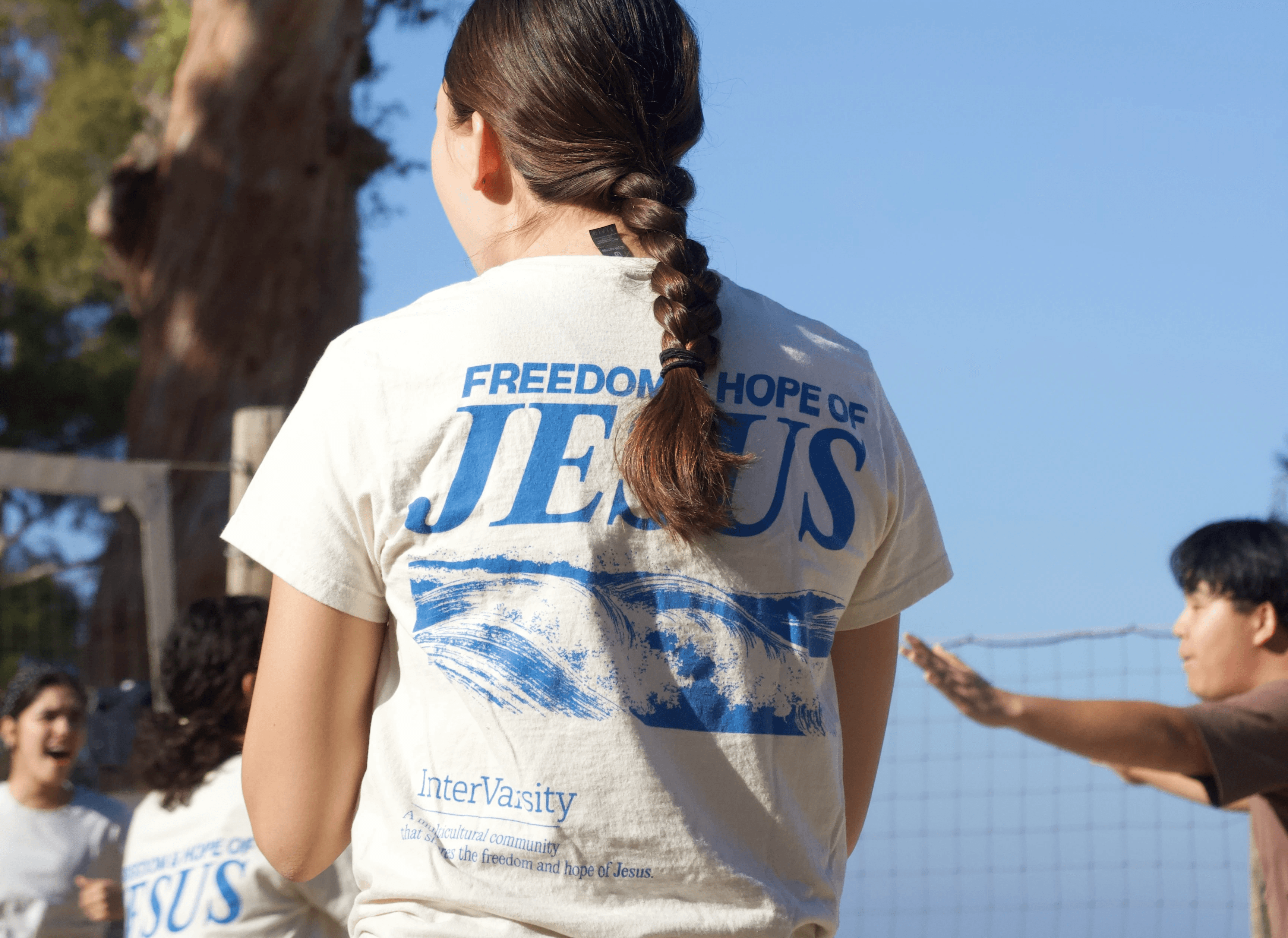
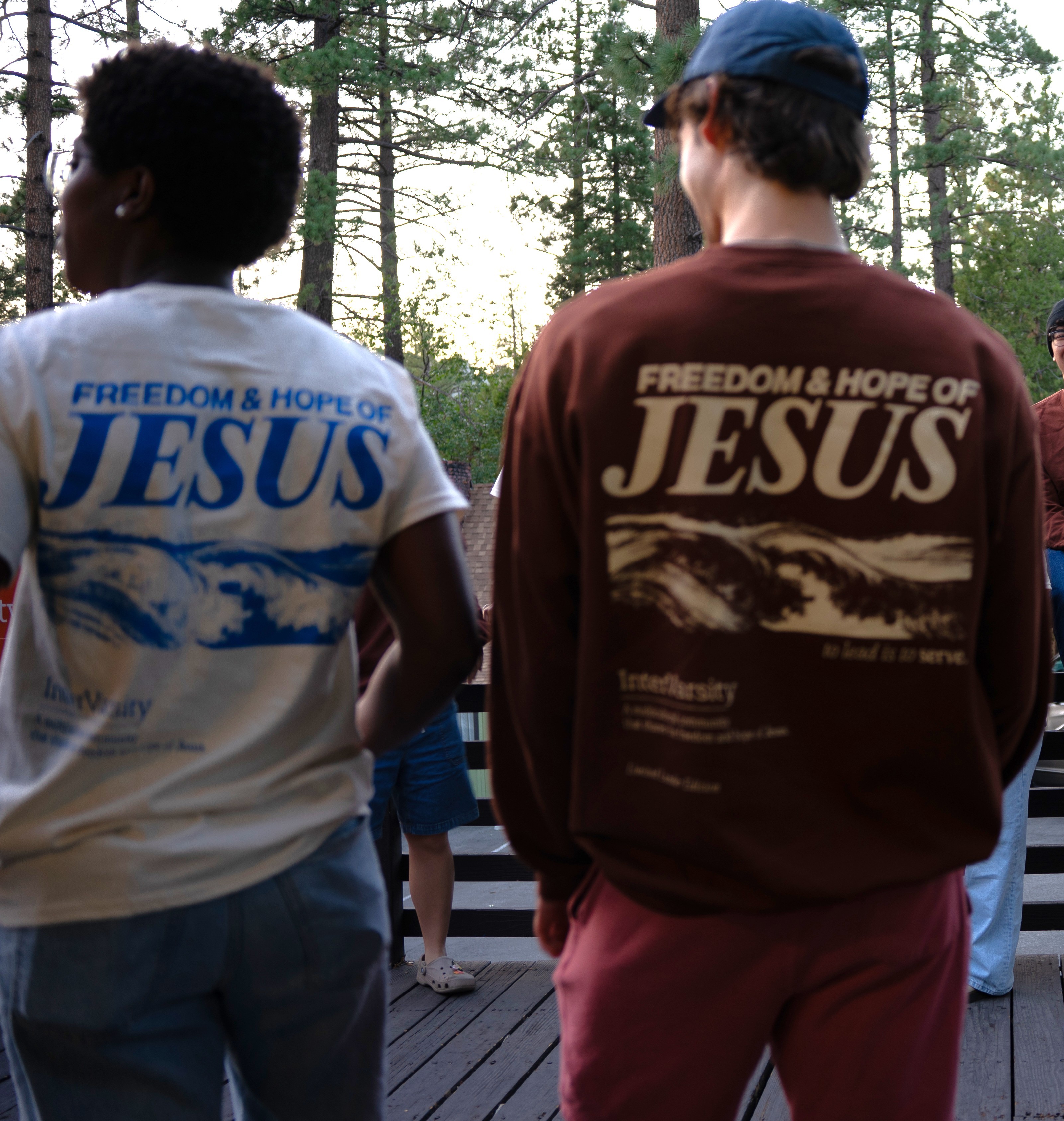
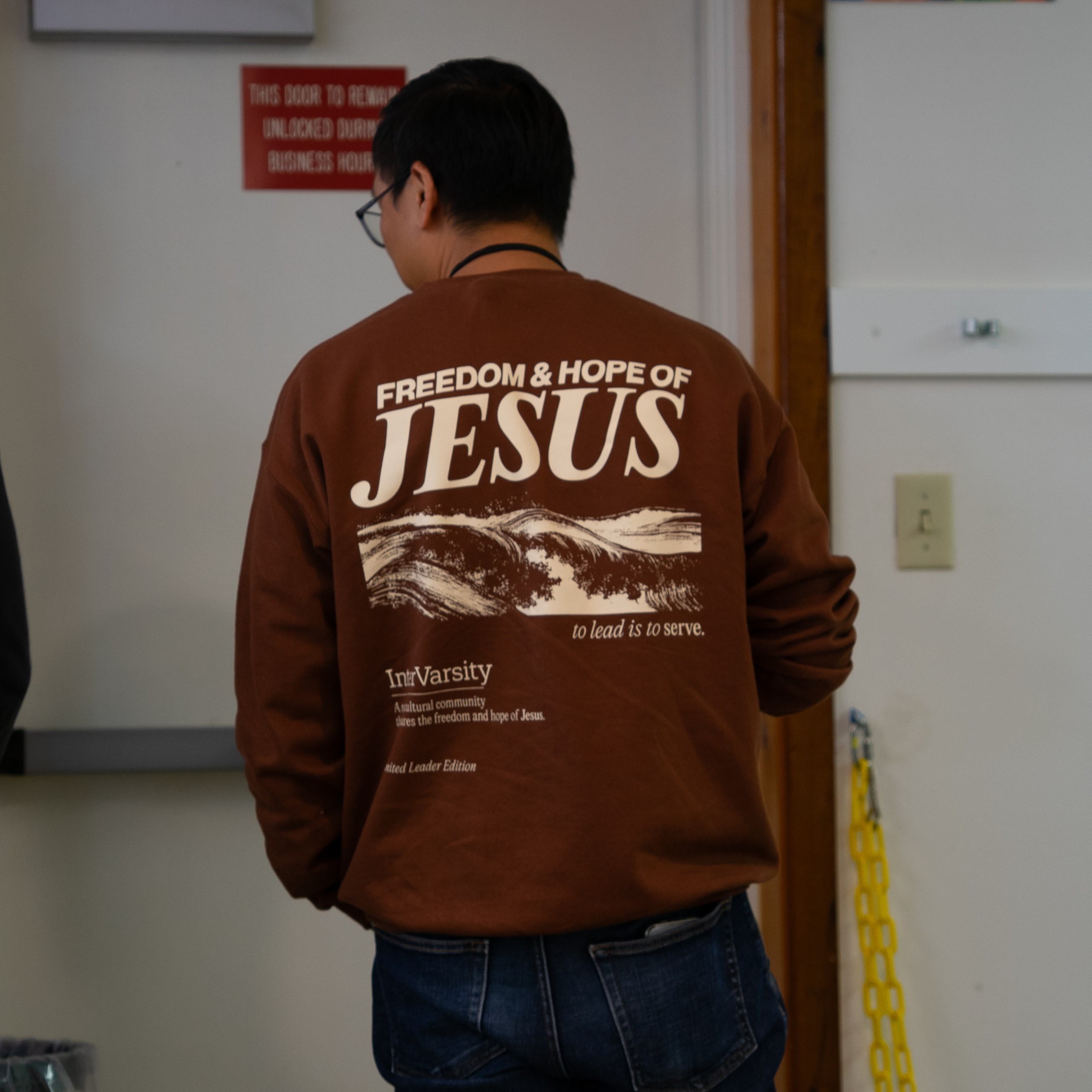
Leadership Sweater & Community T-Shirt
Values reflected:
freedom
hope
servant-leadership
a call to embody the mission
The design features:
refined typography & visual hierarchy
Christian cues
Synergizing colorways that felt "San Diego"
professional yet casual tone
something leaders could wear confidently at training, outreach, and everyday life
I opted for:
bold yet minimal graphic structure
a message that invited people into community
comfortable, durable fabric

C. Iteration
I cycled through multiple rounds of refinement:
adjusting typographic weight
experimenting with scriptural references
exploring composition layouts
finding the right balance of subtlety vs intentionality
working with leadership for clarity on messaging
ensuring designs reproduced cleanly on screen-print
I virtually tested mockups on:
sweaters
comfort color tees
unisex cuts
D. Production
I prepared:
print-ready vector files
color-separated layers
sizing guides
standardized margins
brand-aligned color palettes
Then worked with leadership to lock in:
apparel choice
vendor pricing
style variations
06 Results & Impact
Community Response
The merch was an immediate hit:
leaders loved it
new students wanted it
returning students wore it proudly
Regional Adoption
The design was so well-received that:
InterVarsity San Diego adopted it as the official 2025 merch for the entire region.
That means:
multiple campuses
multiple ministries
dozens of leaders
hundreds of students
…all wearing the same unified visual identity.
Cultural Impact
The merch:
strengthened identity
built unity across campuses
gave leaders a visual expression of their commitment
offered students something they genuinely enjoyed wearing
One leader said:
“I love wearing this merch everywhere!”
07 What I Learned
This project taught me how to:
design for identity, not just aesthetics
balance personal creativity with community values
translate faith into design in a way that’s warm, not performative
adapt typography + design systems to physical products
work with real constraints: budgets, screenprinting, fabric, scaling
co-design with a ministry team
craft something people love wearing
More than anything, it reminded me:
Design is a tool for building belonging.
