Picking safe restraunts without explaining why
User Research, UI Design
Team 4
10 Weeks
A Google Maps dietary filter for people who quietly vet every restaurant their friends suggest.
Our teammate's friend went to the ER after eating a Burger King chicken nugget. The sauce had peanuts in it.
Nobody told her.


We built a layer inside Google Maps that filters restaurants by specific allergens, flags allergens on individual menu items, and works as a discreet planning tool — letting someone suggest a safe restaurant to a group without ever disclosing why. The shape of that layer was determined by something our research found that we didn't go in looking for: most people with serious restrictions hide them from their own friends.
User Research
Five interviews with people who have serious dietary restrictions. One with a server. Conditions ranged from a class-4 peanut allergy to multi-legume anaphylaxis to lifelong vegetarianism.
We expected an information problem. We found a social one.
01. Google Maps is already broken for this group.
Jessica searched "peanut allergy friendly" on Google Maps live, in front of us. The results were frozen yogurt and salad chains.
So she runs a three-tier search every time she eats somewhere new: specialty allergy sites, region-specific subreddits, Google reviews. The moment she's hungry with friends and out of time, that process collapses. That's exactly where her worst incident happened.
02. People hide their restriction from their own friends.
This was the moment the project shifted.
Jessica only tells her closest friends she has a peanut allergy. With acquaintances she'll pretend to dislike a dish rather than explain. "I feel bad having to have people accommodate for me. So I probably just won't say it."
Sam put it differently: "I'd rather feel embarrassed than die."
Victor has skipped meals at birthday parties his whole life. He didn't want to be an obstacle.
The word that came up over and over was inconvenience. These people are running silent research while their group is deciding where to go. The opportunity wasn't "build a filter." It was: let someone propose a safe restaurant to the group without ever outing themselves.
03. The last line of defense is a server who's guessing.
When pre-vetting fails, the safety check becomes a twenty-second conversation at the table.
Victor was told a pho had no soy. He had a reaction.
Nirel found out at the counter that her boba shop had switched from milk powder to whole milk.
The decision about whether something is safe to eat is being made under time pressure, in front of friends, on information supplied by someone untrained in the ingredient list.
What we Built
The research gave us two non-negotiables.
One: filter by specific allergen, not by "allergy friendly" as a category.
Two: let someone use it without telling their friends why they need it.
Those constraints shaped the most important decision before any screen got designed, where the filter lives. We put it inside Google Maps' existing filter row, alongside Sort by, Open now, and Cuisine. No new tab. No separate mode. Once it's just another filter, tapping it doesn't announce anything about the person tapping it. Discretion through normalization.
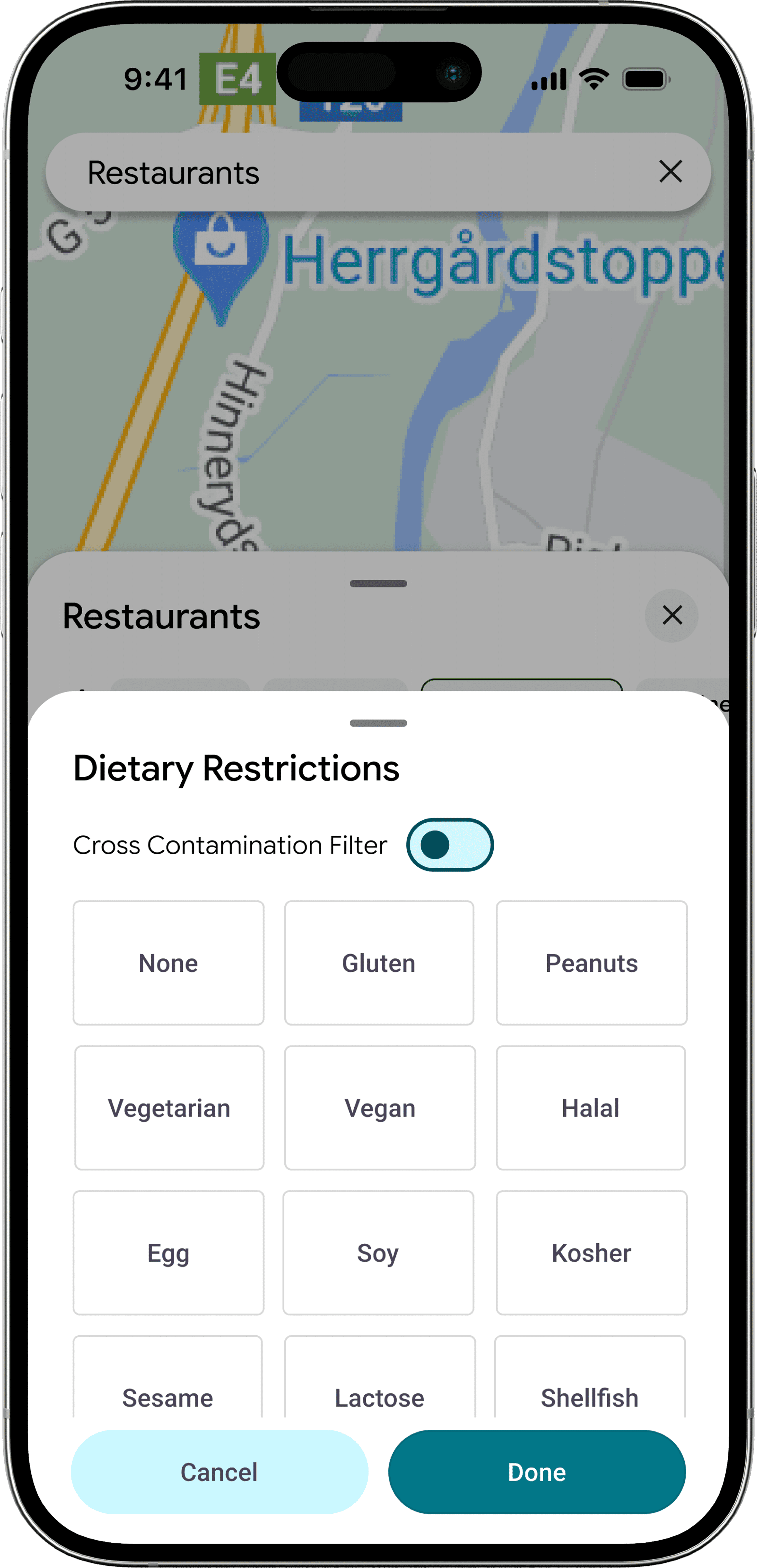
01. The filter popup (M4)
The first version was a flat grid. The research had been explicit that users think in terms of their specific allergen, "peanut allergy" not "allergy friendly," so the filter had to expose individual options, not roll them up.
Two decisions worth naming. First, cross-contamination got its own toggle at the top, separate from the allergen grid. From the interviews, cross-contamination wasn't a kind of allergen, it was a different question about the same restaurant, and conflating them would have made both worse. Second, the grid layout was deliberate: with twelve options, a single visual scan beats a scrolling list. The trade-off is that flat grids don't scale past about twelve items, and the FDA's recognized allergen list, combined with religious and lifestyle diets, is already longer than that. Which set up the second iteration.
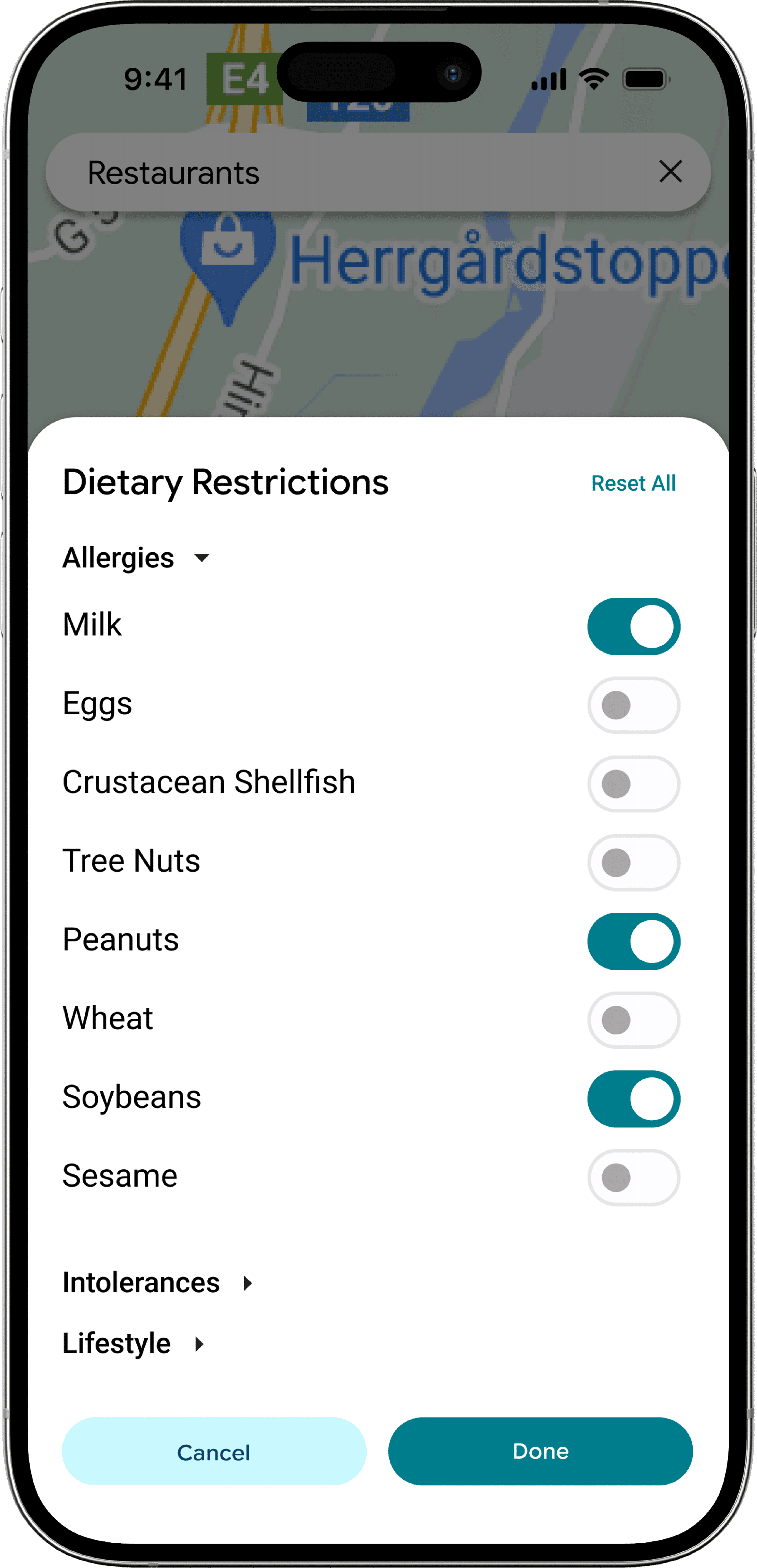
02. The AI-augmented alternative (M5)
The Milestone 5 alternative I designed pushed in a different direction. Instead of treating filtering as the only entry point, I added an AI layer, "Know before you go" with a question-asking interface and suggested queries seeded for dietary contexts.
The bet: filters handle predictable cases (the eight FDA major allergens, common diets), but real restrictions are messier than any filter UI can hold. Someone with multi-legume anaphylaxis, a "may contain soy" tolerance, or a Kosher-and-vegetarian combination needs to ask a specific question, not check more boxes. AI was the obvious fit for that long tail.
I wanted to test the assumption that users would prefer this richer interface. User testing said the opposite, and that's where this case study gets more interesting than I expected.
What We Tested
Six participants, ten-to-twenty minutes each, walking screen-by-screen through both variants. We tested across the severity spectrum we'd interviewed from — peanut and tree-nut anaphylaxis (Sam), multi-legume anaphylaxis (Victor), a milk-and-raw-produce allergy (Nirel, our original interviewee returning), Halal (Dipa), and Keto (Raymundo, our oldest tester at 58). Variant order was alternated to control for ordering bias. Screens were static, so we couldn't test interaction flow — only comprehension, perceived trust, and which version they'd actually use.
Two findings reshaped the next iteration.
Filtering beat AI as the primary path. Almost every tester preferred manual filtering and treated AI as a helper, not a replacement. "Harder to reach a larger audience — there's no ability to teach older folks how to use it," said one. "Old people may not know how to use a chatbot," said another. The chatbot felt opaque; the filter felt legible. Even testers who liked the AI explicitly said it should support filtering, not replace it.
Categorization beat the flat grid. Nirel, Dipa, and Victor independently asked for the M5 categorized structure (Allergies / Intolerances / Lifestyle) but with the M4 square buttons inside it. Two competing iterations converging on the same synthesis from three different testers is about as clean a design signal as user testing gives you.
The thing I had to update
I'd designed the AI alternative expecting it to feel more powerful — a richer, more conversational way in for the messy edge cases a static filter can't hold. Testers respected the AI but consistently wanted it as a helper, not the front door. Victor put it bluntly: he found the filter "much more intuitive," and the AI version added "a second to understand what was filtered out." That gap between what I'd designed and what the testers needed — between sophistication and legibility — is the part of this project I'll keep thinking about. The right move wasn't to push harder on the AI; it was to make the filter so clear the AI could quietly sit behind it.
Before & After
The synthesis from testing produced two concrete iterations — one to the filter popup, one to the search results. Each change ties back to a specific tester moment.
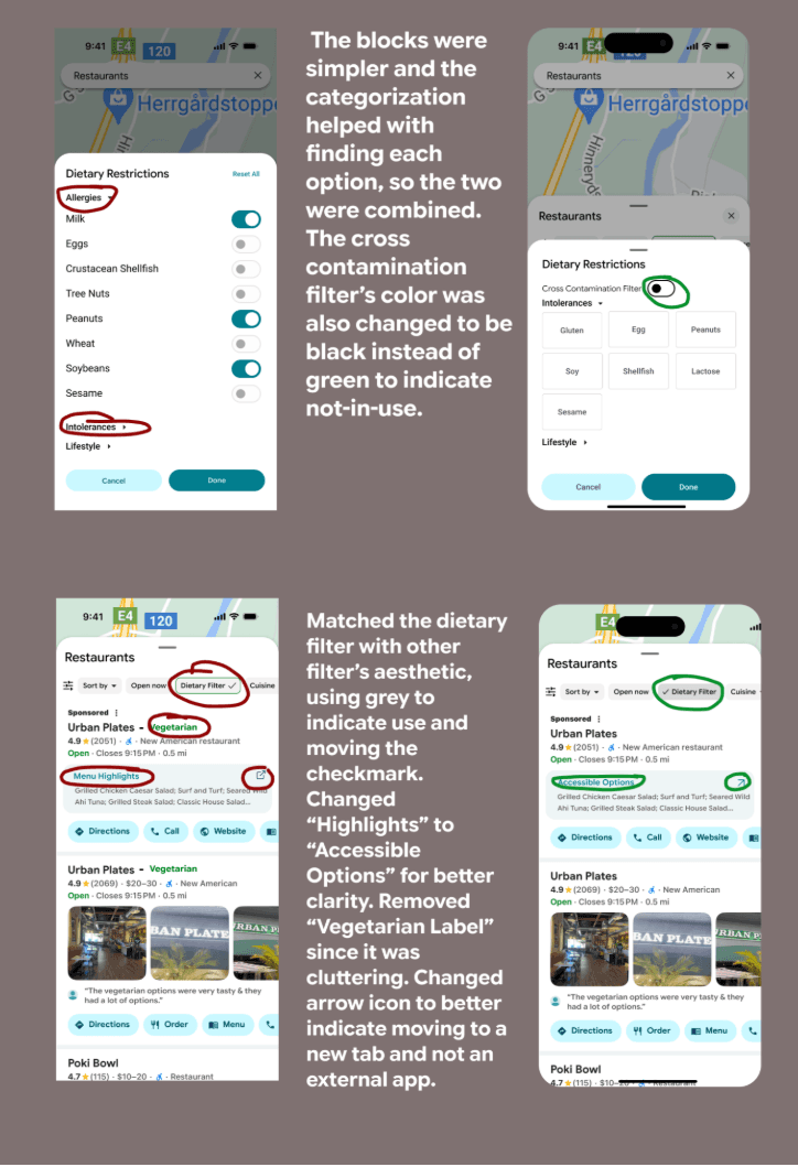
01. The filter popup
Three testers independently asked for the same thing: the M5 categorized structure with the M4 square buttons inside it. The next version delivers exactly that — Allergies, Intolerances, and Lifestyle as expandable categories, square pickers inside each, cross-contamination still anchored at the top.
The smaller call: cross-contamination's toggle color flipped from green to black when off. The previous green-on-when-off state was reading as active even when it wasn't. A neutral off-state and a teal on-state gives a cleaner two-state read — and set up the same principle for the filter status in the search results row below.
[Insert: bottom half of your before/after image — the search results change]
02. The search results
Three changes here, each traceable to a specific tester moment.
The Dietary Filter status was reworked to match Google Maps' native filter aesthetic — grey background, inline checkmark — instead of a green outline that read as foreign in the row. Filters should feel like filters. Making it visually identical to Sort by and Cuisine preserves the discretion principle at the result-level UI: nothing about the row tells the friend looking over your shoulder anything about why you tapped it.
The label Highlights became Accessible Options. Victor had spent a beat trying to figure out whether "Highlights" referred to popular dishes or filtered-safe ones — he couldn't name the right substitute himself, but the confusion was the data point. Accessible Options names the thing it actually is.
The green Vegetarian tag next to the restaurant name came off. It was redundant — the filter was already on; every result was vegetarian — and Raymundo's note about cluttering pushed us to cut what wasn't earning its space. The arrow icon next to Accessible Options also changed from an external-link glyph to an in-app navigation glyph, since the link stays inside Google Maps, not out.
None of these changes is dramatic in isolation. But the pattern is what the project is really about: every adjustment removes a moment of cognitive friction. For a user who already runs a three-tier search to find a safe meal, every tap, every label, every ambiguous icon is a tax. Each iteration shrinks the tax a little.
Closing
The project that finished isn't the project we started. We came in expecting to design a better filter. We left having designed a tool that does its most important work by not being noticed — sitting in the same row as Sort by and Cuisine, indistinguishable from any other filter someone might tap.
That's the part I keep coming back to. The strongest design move on this whole project wasn't a feature; it was a refusal — to make the dietary layer feel different, to put it in its own tab, to surface it with any of the "we care about your safety" UI patterns the category usually reaches for. Discretion meant building something that visibly belongs alongside everything else Google Maps already does. The user is the one who knows what it means; nobody else has to.
If a layer like this shipped, the bet is small but specific: the half of America currently running a three-tier search on their phone while their friends are deciding could run zero tiers, in front of those friends, without anyone knowing why. That's not a dramatic outcome. It's just an ordinary social activity becoming ordinary again.